2026 Canadian Grand Prixrace pace, traffic, racecraft & strategy analysis
15 charts built from the official timing of the Canadian Grand Prix. Click any chart to enlarge it.
The driver ratings, replay and lap chart are on the race page.
Who was genuinely quick over a race distance, once traffic, fuel load and tyre age are accounted for.
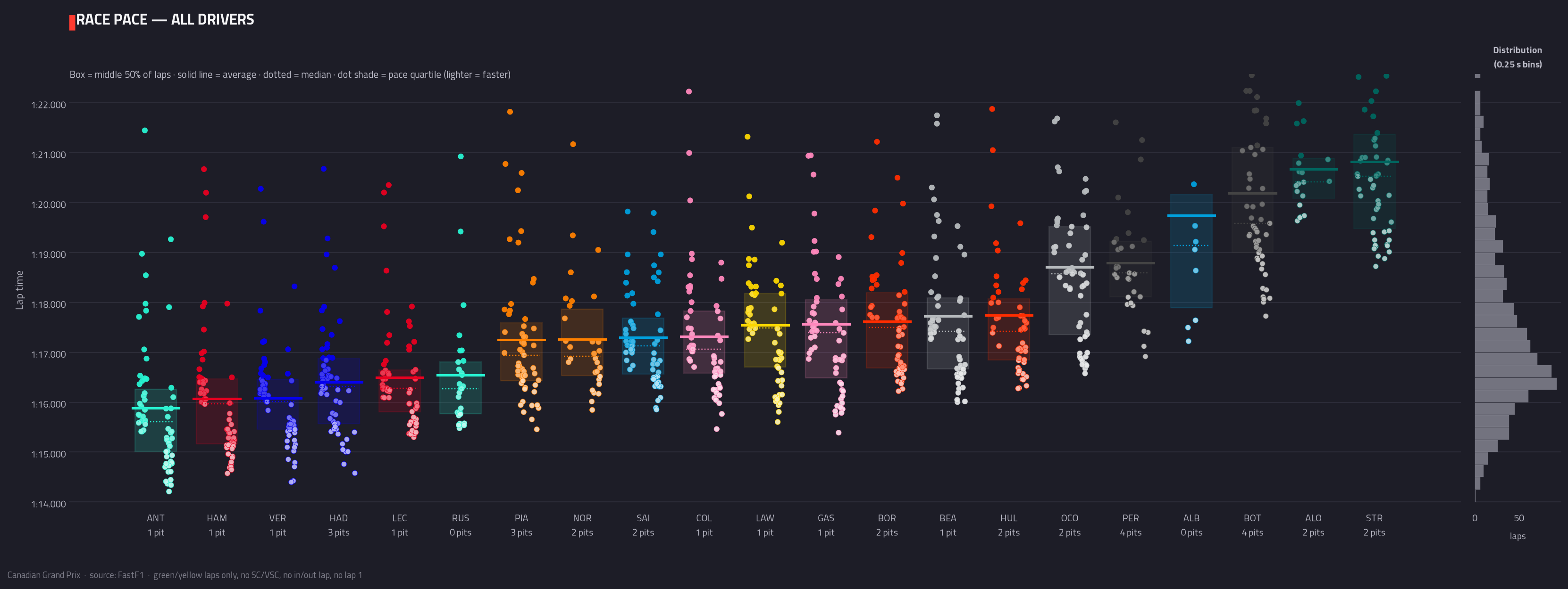
PaceRace pace — all driversEvery clean racing lap, one column per driver, ordered by typical (median) pace, fastest to the left. The shaded box is the middle 50% of laps, the dotted line the median, the solid line the average.
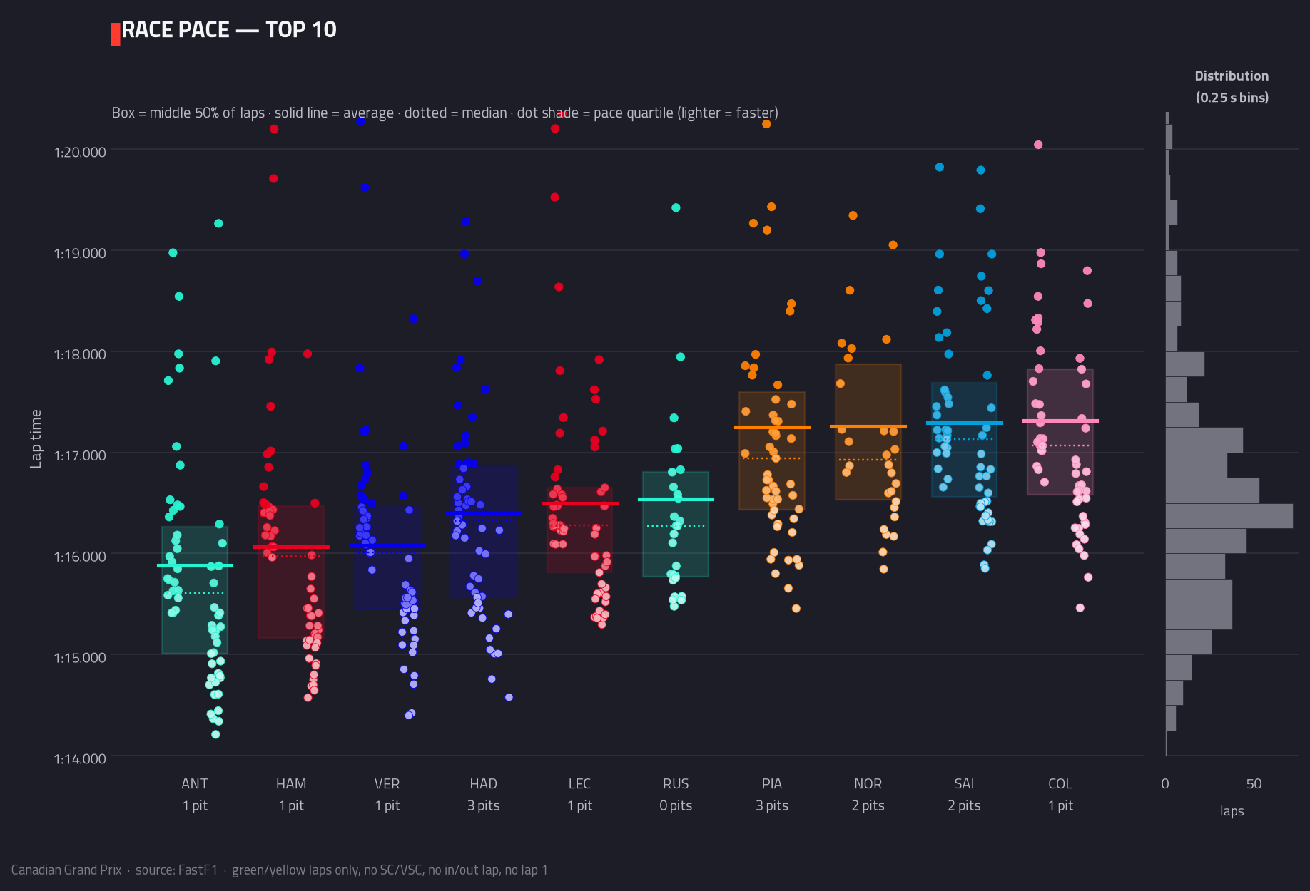
PaceRace pace — top 10The same lap-by-lap picture, narrowed to the ten drivers with the fastest typical (median) clean pace so the battle at the front is readable.
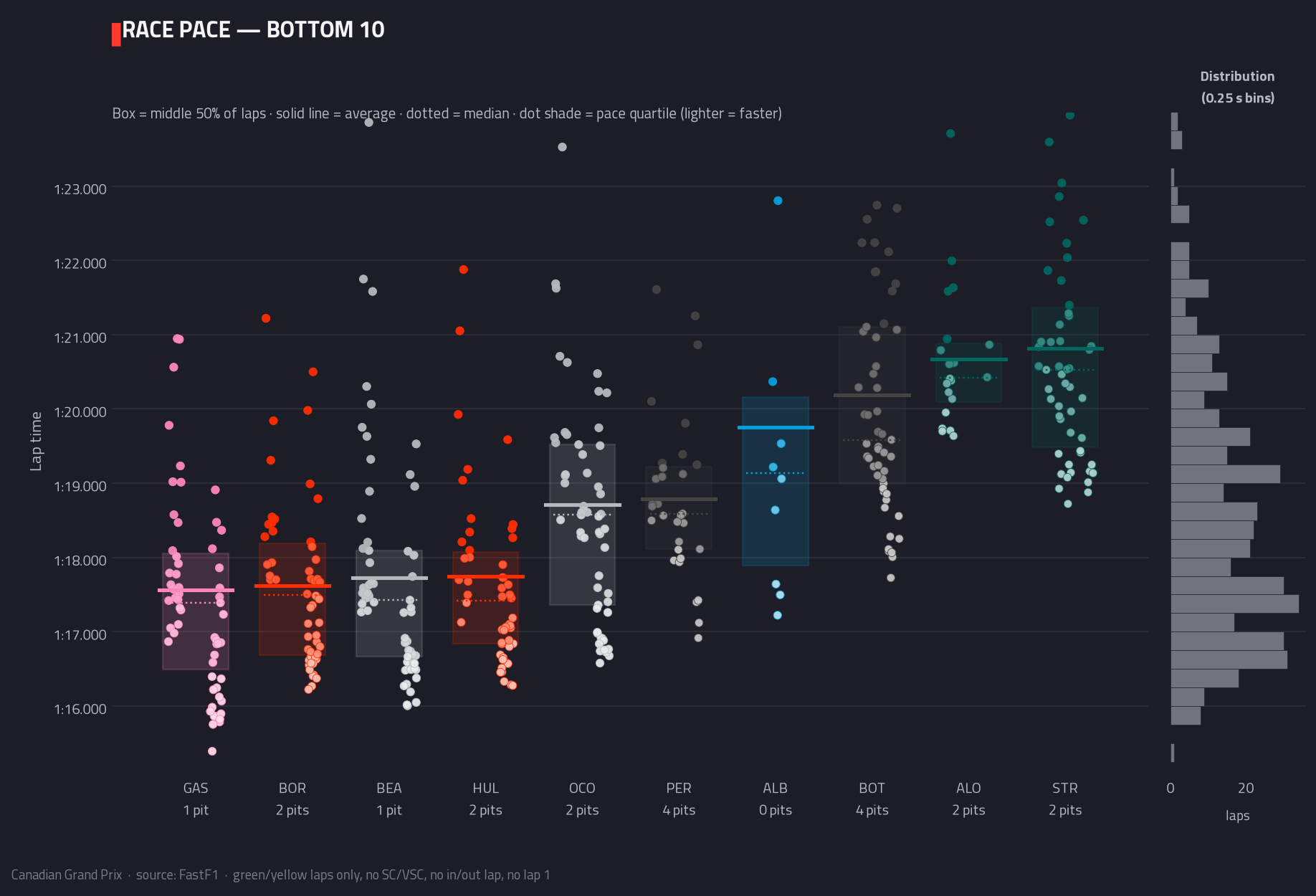
PaceRace pace — bottom 10The same picture for the ten slowest typical (median) clean paces — often where the scrappiest racing of the day happened.
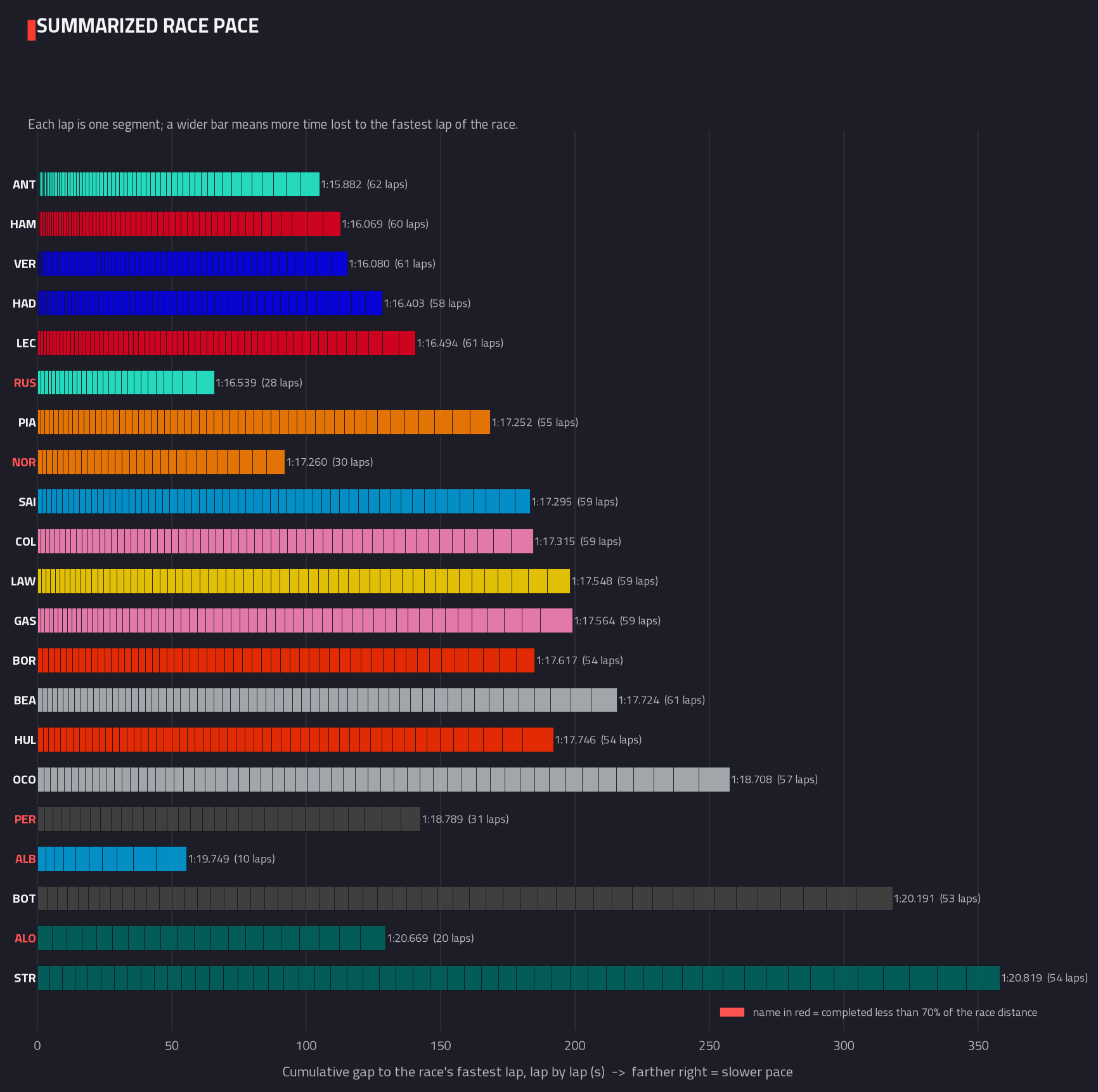
PaceSummarised pace distributionLays every lap a driver completed end to end, each one sized by how far off the race’s single fastest lap it was. A driver who stayed close to the ultimate pace all race ends with a short bar; one who shed time lap after lap ends with a long one.
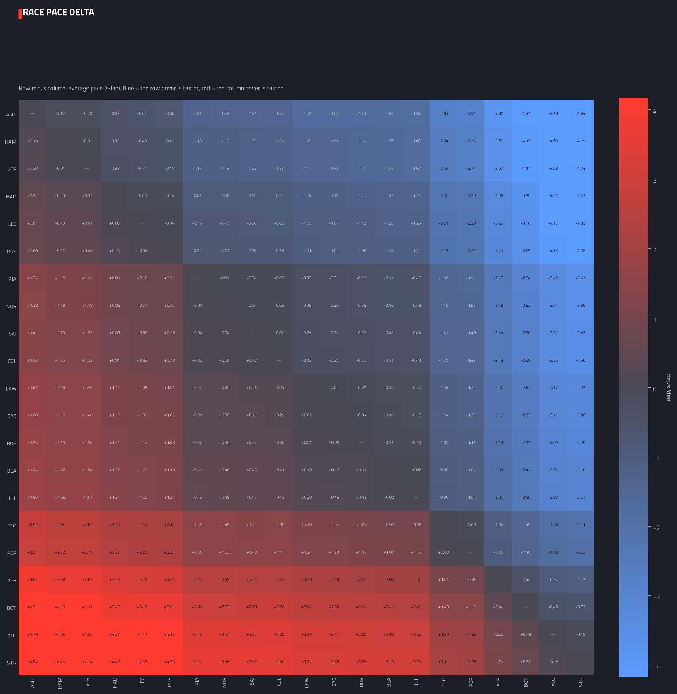
PaceHead-to-head pace delta matrixEvery driver’s average race pace compared against every other driver’s, one pair at a time. Read across a row to see exactly how much faster or slower that driver was than the rest of the field.
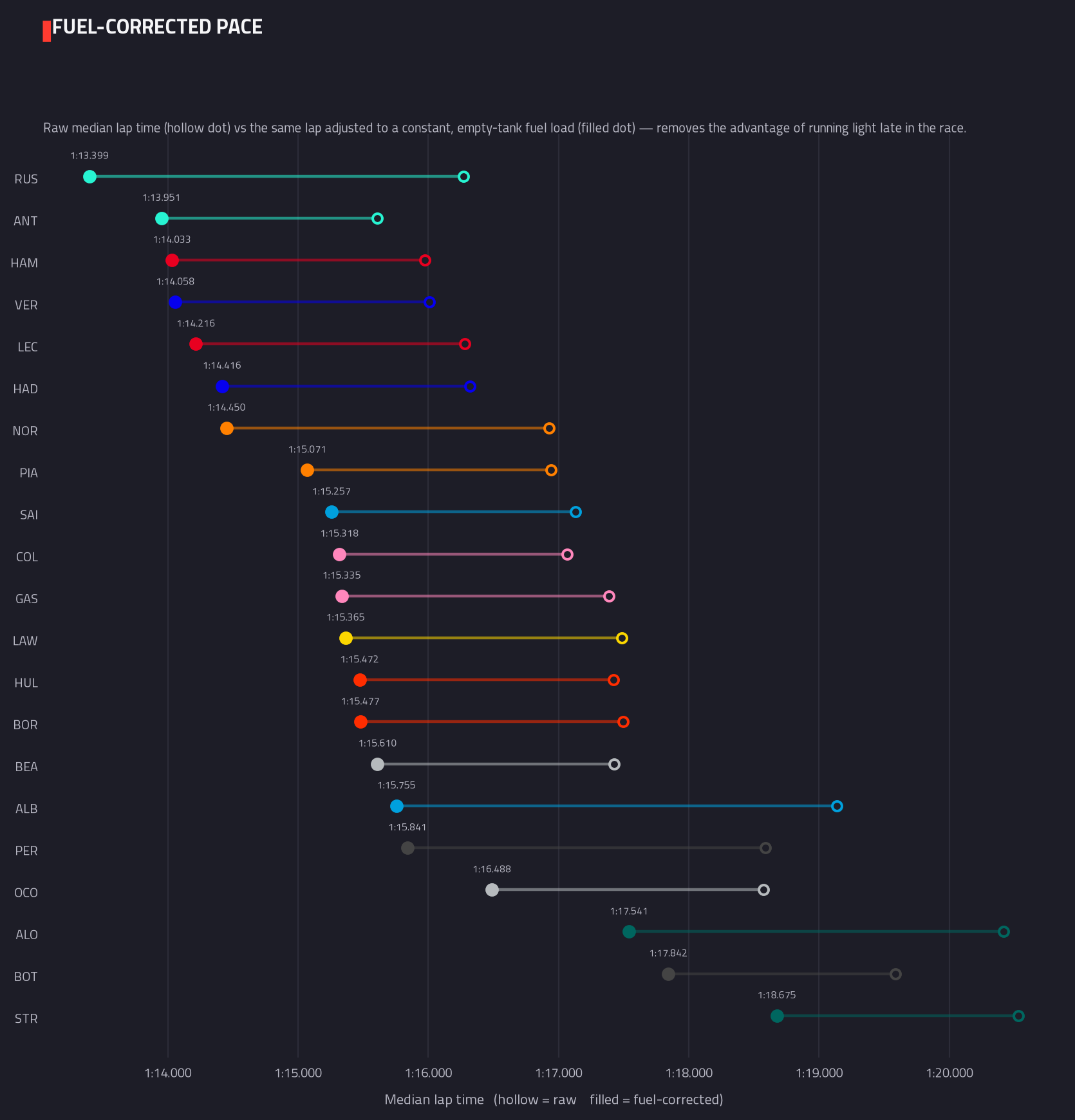
PaceFuel-corrected pace rankingRanks drivers by typical lap time after levelling out the fuel each car was carrying — a heavy car early in the race is unavoidably slower than the same car on a near-empty tank late on, so the correction puts every lap on equal footing.
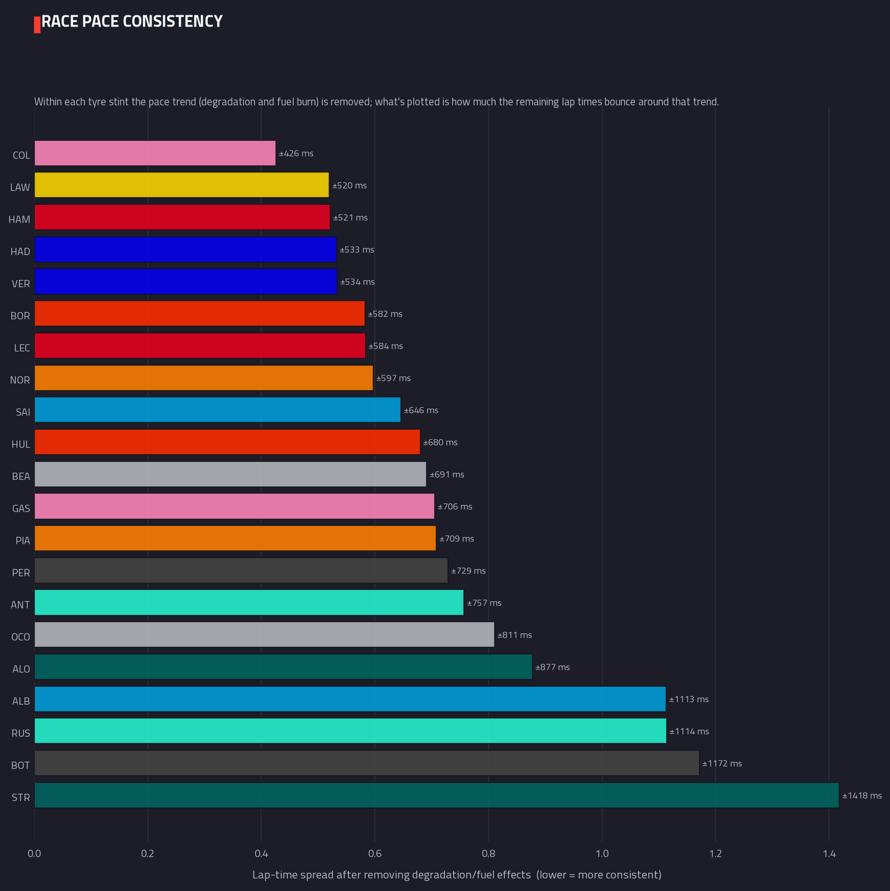
PaceLap-time consistencyMeasures how tightly a driver’s lap times clustered together once the natural trend of a tyre stint — cars speeding up as fuel burns off, slowing as tyres wear — is stripped out. A small number reads as metronomic; a large one reads as an up-and-down afternoon.
Traffic
How much of each driver's afternoon was spent stuck behind another car, and what it cost.
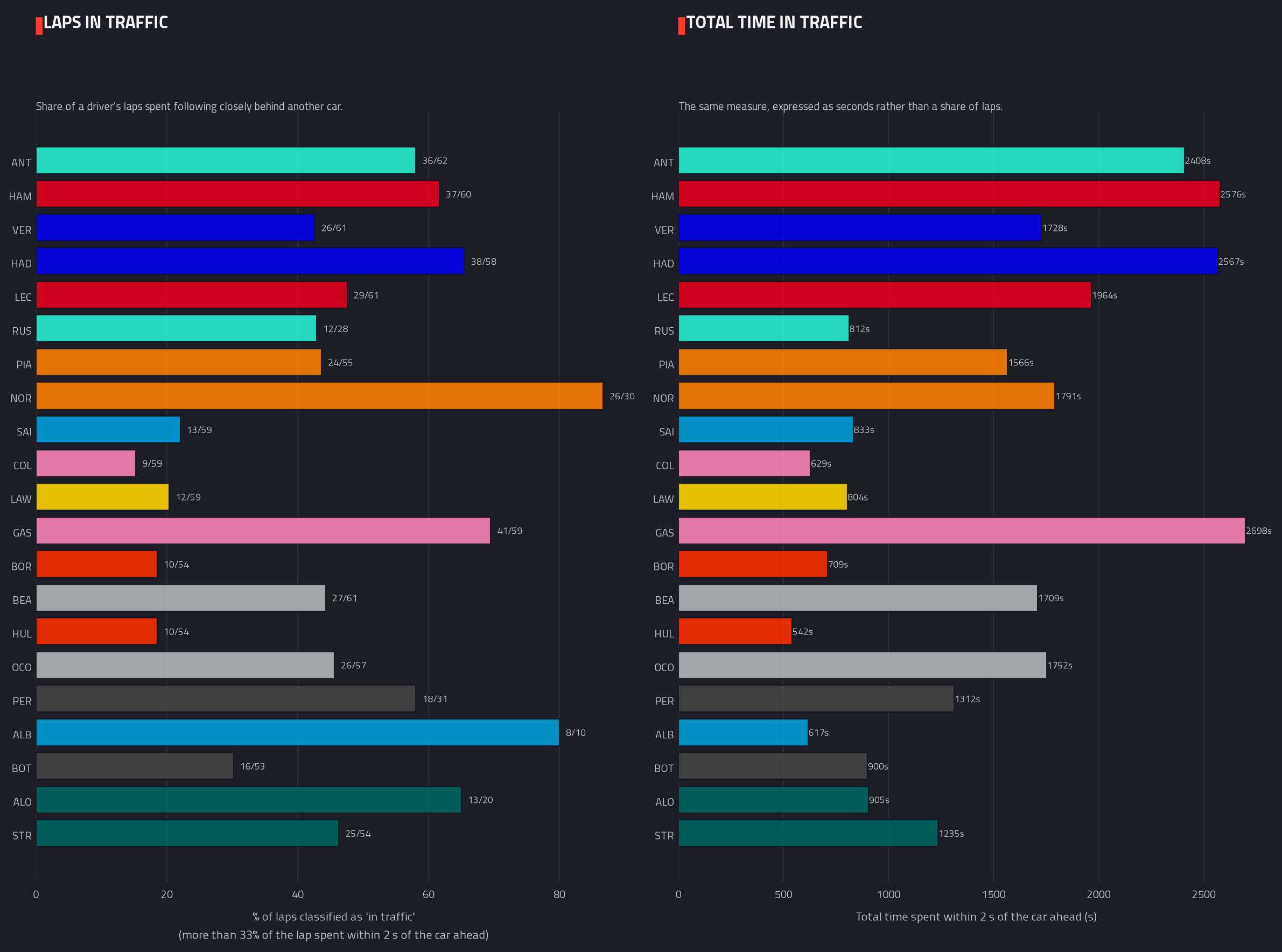
TrafficLaps spent in trafficCounts how many laps each driver spent running close behind another car rather than in clean air, shown both as a share of their race and in raw seconds lost — traffic that can flatter or mask a driver’s true pace.
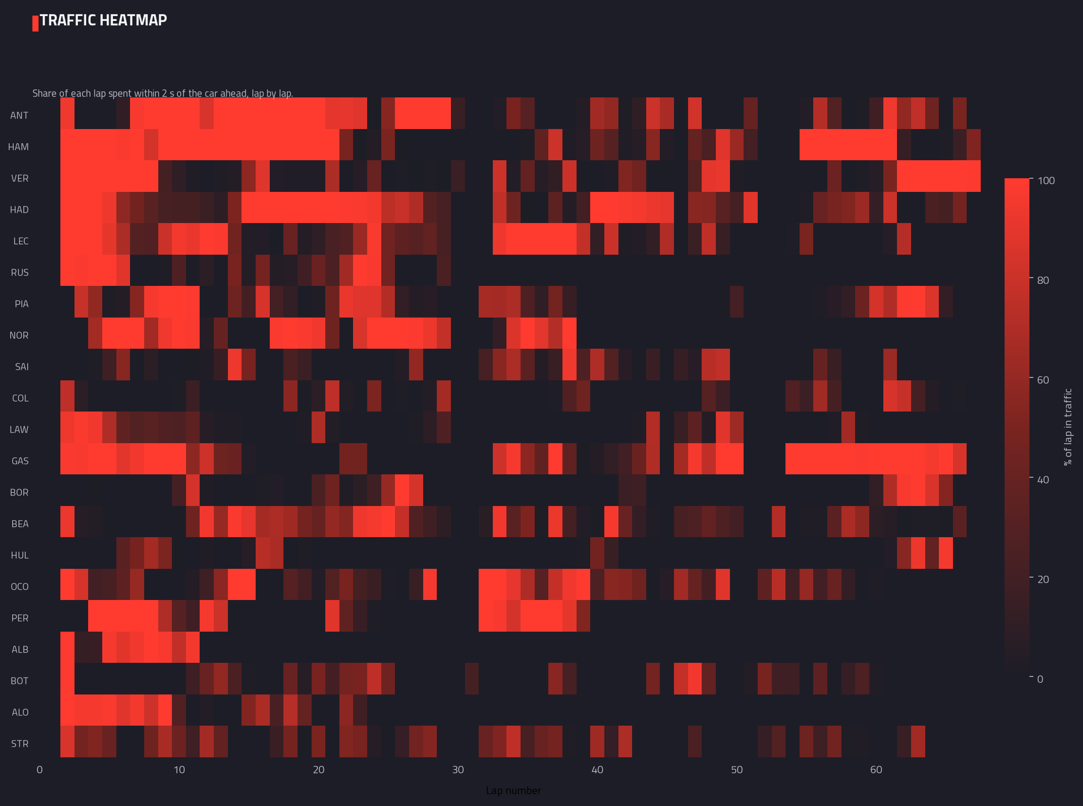
TrafficTraffic heatmap (lap by lap)The same traffic measurement laid out lap by lap across the whole race, so you can see exactly when each driver got stuck in a queue and when they broke free into open track.
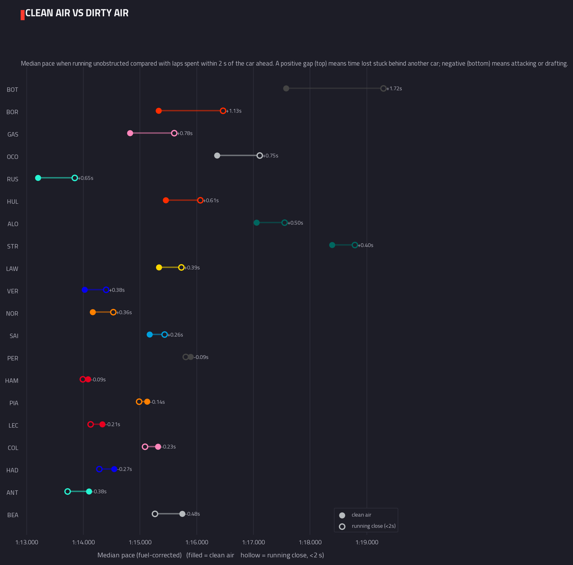
TrafficClean air vs dirty air paceCompares each driver’s pace when running unobstructed against their pace while stuck within two seconds of the car ahead — showing who lost the most time to traffic, and who was on the attack rather than stuck in it.
Racecraft
The racing itself: places gained off the line, genuine on-track passes, and the team-mate comparison.
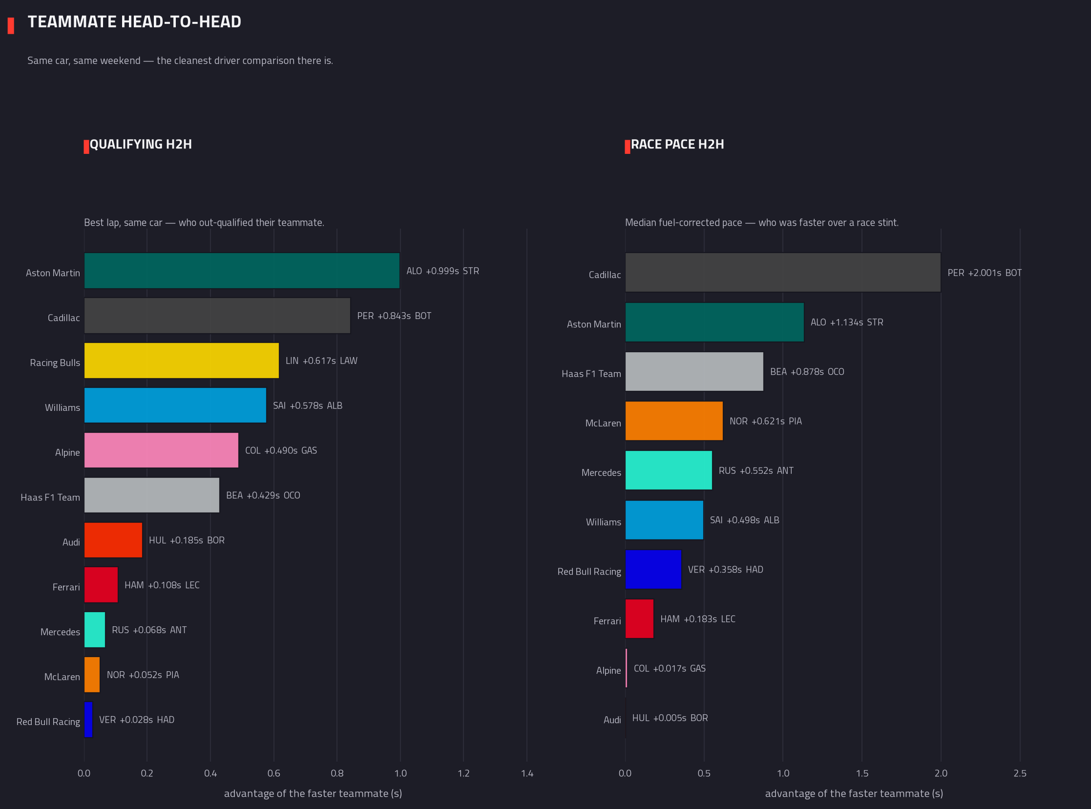
RacecraftTeammate head-to-headThe most controlled comparison the sport offers: same car, same weekend. Shows which driver in each team had the faster qualifying lap and which had the faster race pace, and by how much.
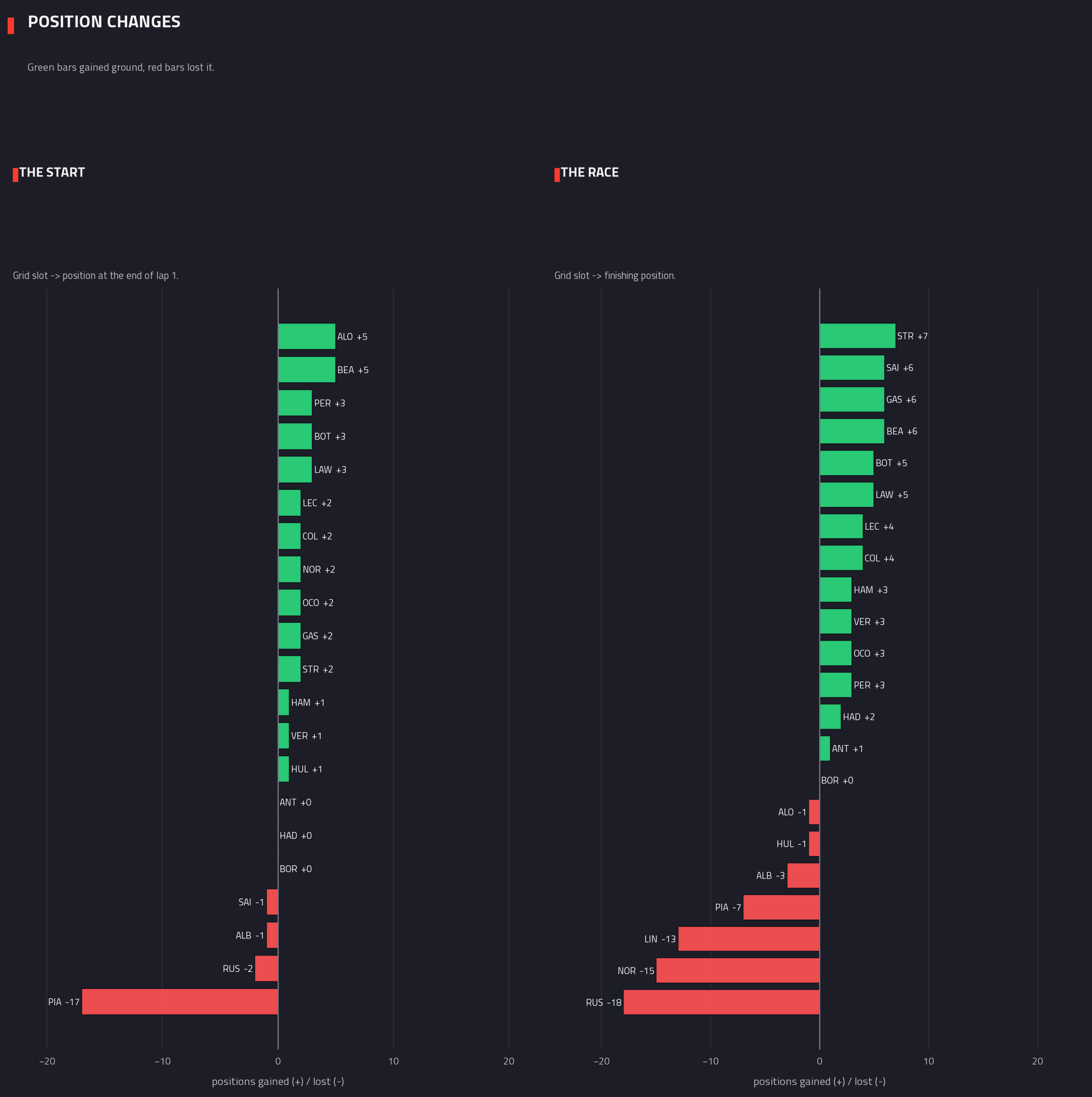
RacecraftPositions: start vs finishTracks positions gained or lost twice over — from the grid to the end of the opening lap, and separately from the grid all the way to the chequered flag.
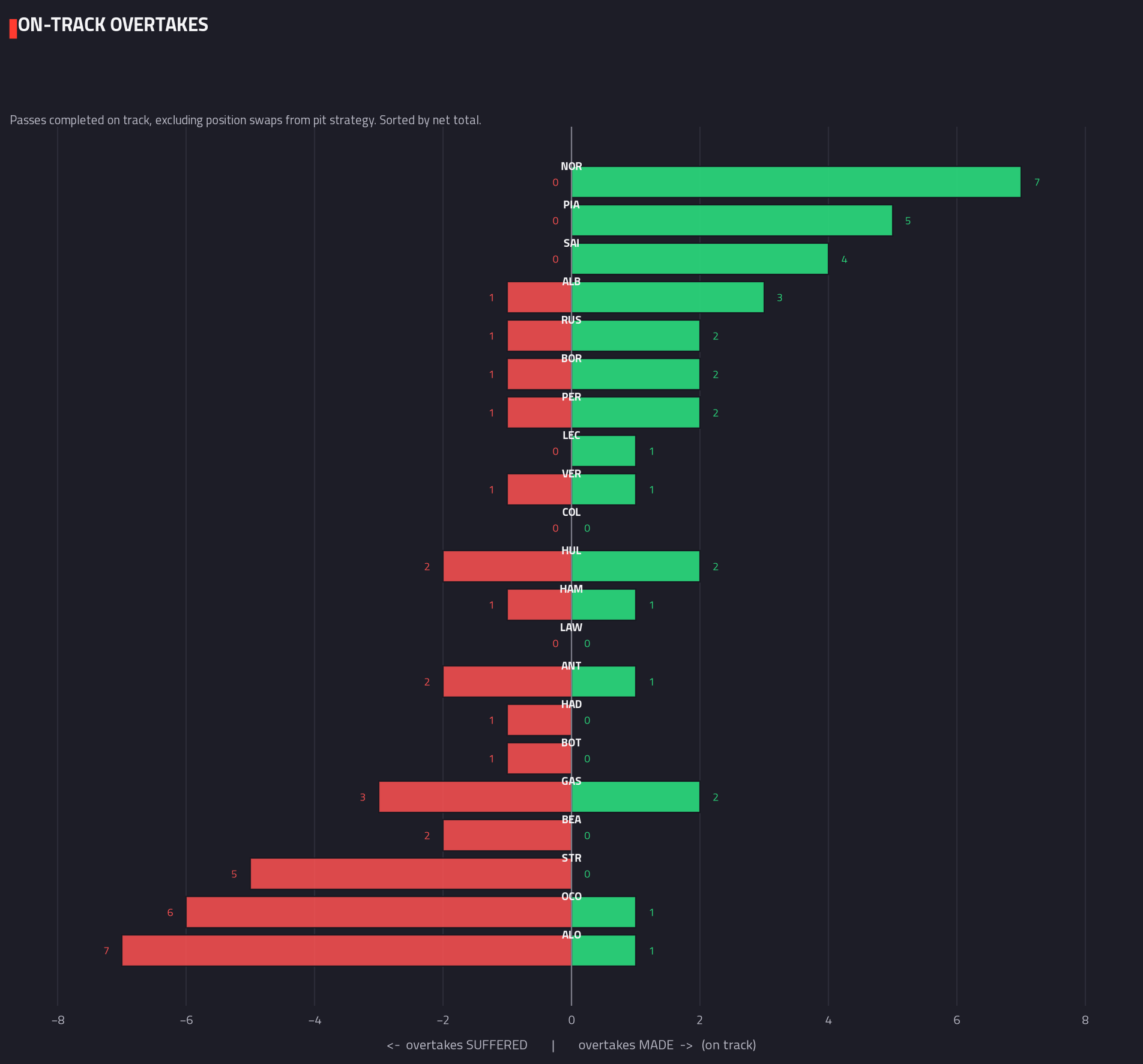
RacecraftOvertakes made & sufferedCounts genuine on-track passes — not positions swapped through pit stops — made and suffered by each driver, sorted by their net total for the race.
Strategy
What the pit wall did: tyre choices, stint lengths, and how each compound faded.
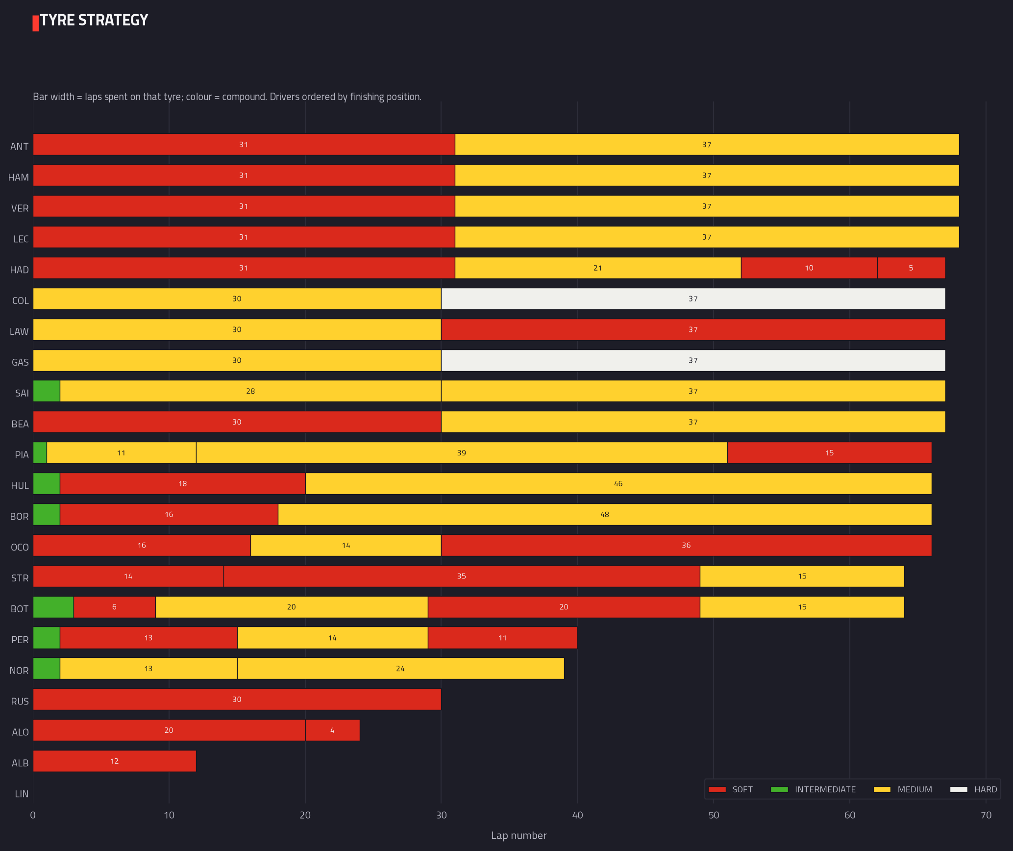
StrategyTyre strategy & stintsEvery driver’s tyre strategy laid out as a timeline: which compound they started and switched to, how many laps each set covered, and when each stop happened.
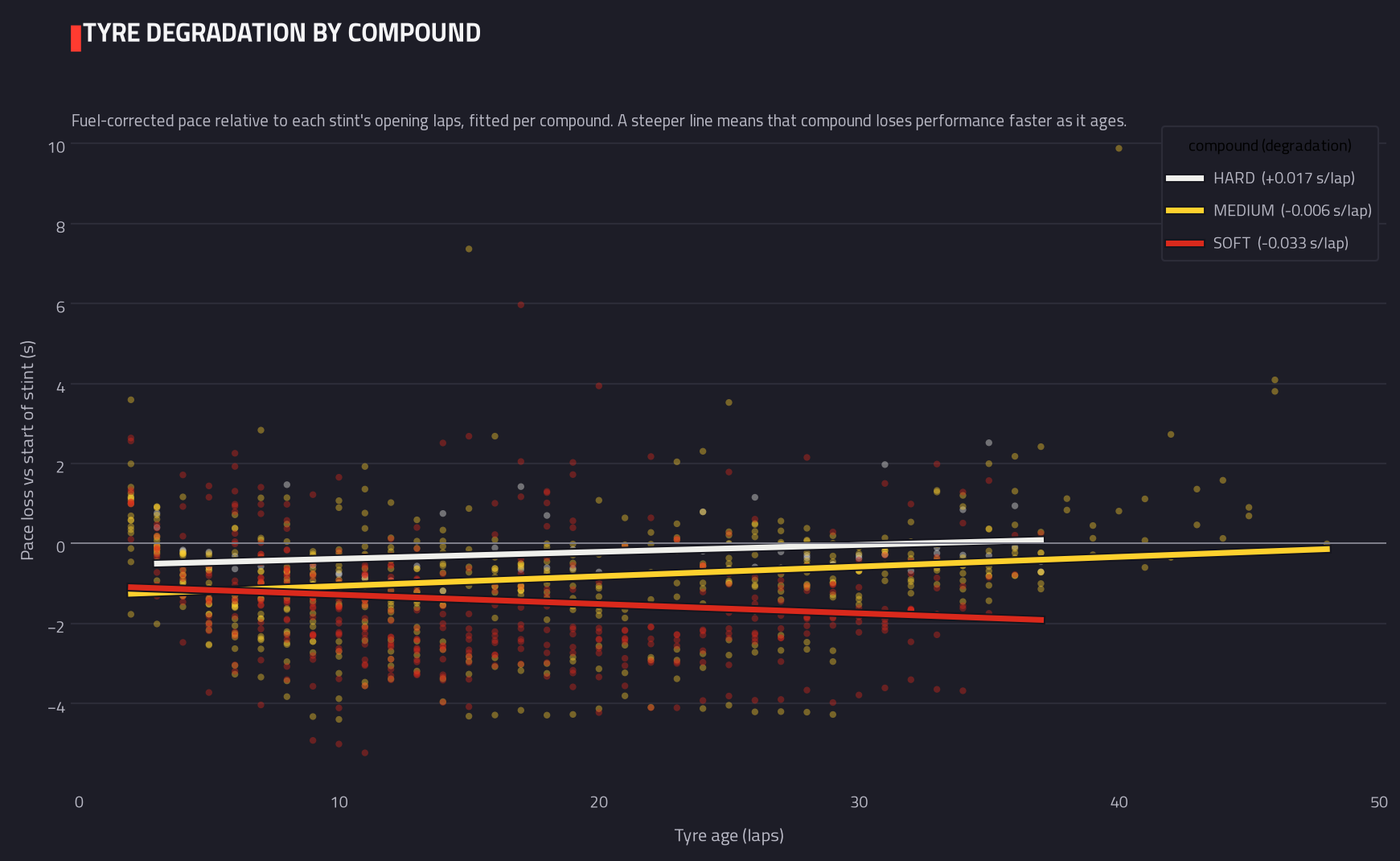
StrategyTyre degradation by compoundTracks how much pace each tyre compound loses as it ages within a stint, averaged across every driver who ran it — the steeper the line, the faster that compound fades.
Analytics charts for this race are still being generated.